
The article “Computing in Architectural Design” by Yehuda Kalay provides a very detailed description of the history of the use of computers to aid in design dating back to the 1950s. Beginning with Ivan Sutherland in the early 1960s and his development of the “light-pen” and sketchpad, computer aided design has come an extremely long way. The concept for this first system was one in which the draftsman would draw using the light-pen onto a complex display known as a sketchpad, where the computer would process what has been drawn by hand and convert it to math and a graphed set of numbers. The article follows the timelines through the decades describing high points of noteworthy breakthroughs of CAD technology. Some lessons I took from this article are that technology will never stop getting faster and smaller, and by the time a new precedent is set in CAD, there is already something more innovative in the works. The most important point I took from this article re-enforces the thinking I have been talking about for years: no matter how far technology advances, the most precious resource in the world will always be the creative thought processes of the human mind.
Thursday, May 27, 2010
Tuesday, May 4, 2010

DESIGN HAPPINESS
As students in the field of design, we are privileged to expand our knowledge in areas that can be applied in many aspects of life. Understanding basic elements of design such as line, form, and color transcend the purposes we typically use them for. Of course when designing an apartment, a coffee table, or a car, control and use of these elements are essential. However while learning to control design elements and principles, we are also learning to control the things that greatly affect our happiness. The same thought processes used to design an apartment and a coffee table, are also used to write a piece of music, or cook a good meal. At first, this may sound odd, but if you reduce what you are doing when you are cooking, drawing, or playing music to their most refined state, you will see that when doing most things that make you happy, you are in some way always doing the same thing, you are just using a different vehicle to get there.
Music is one thing that makes me happier than most other things in the world. For me, making music is not unlike designing. I have written a piece of music on my bass guitar that is a representation of the way I would describe my design process. The piece represents the course of a project from start to finish. Starting with a steady rhythm, each project or design always starts with an idea or a spark. This idea is explored for a while, leading to new avenues and ideas that are also explored. We go back and forth between two or three ideas, always in search of the Utopian design: the one design that answers all of the questions and inspires everyone who engages the piece. Inevitably, we always end up over-thinking and over-analyzing until we grind to a halt. But eventually we make a decision, head in a direction, and rework our ideas until we arrive at our final product. At that point we are happy to have made it to the end, excited the struggle is over, and looking forward for what will come next. It was my goal to embody this process in this piece of music entitled ‘Keep Moving.’
- Jeff Linn
Wednesday, April 28, 2010
 This is a design that makes me VERY happy. This is a picture of a Warwick Dolphin Pro I Bass that is the same model that I have owned and played for 8 and a half years. I have played literally hundreds of bass guitars in the course of my life, and I have yet to play one that I feel has been better designed than this one. Obvious masterfull craftsmanship are demonstrated throughout evry minute detail of this instrument. For example, the body of the bass actualy curves to fit the contour of your body so it is more comfortable to play. The frets are made of the same bronze used to make bells to increase resonance of the stringas and increase tone depth and sustain. I could talk for days about why this is an example of excellence in design. I could talk for even longer about why exactly this design make me happy. Mostly, this is the one designed object that I have in my life that inspries me every time I pick it up, and I notice something new to appreciate about it every time I play it.
This is a picture of a Fender Precision Bass. I own a mexican version of this bass, which was my very first bass. While I truly love this instrument, I can also say that there are many things about this design I would LOVE to change. I will never sell or get rid of this bass, but at the same time, I definitely plan on making some improvements to the design at some point. This was the original design of the first electric bass guitar that was developed in the early 50's by Leo Fender. It was a design that changed the chape of music forever, and layed the foundation for an eternity of Electric Bass musicians. Since its design, it many other basses have been designed and created, but with out this one, none of the others would exist.
Friday, April 23, 2010
PRESENTATION BOARD STATEMENT
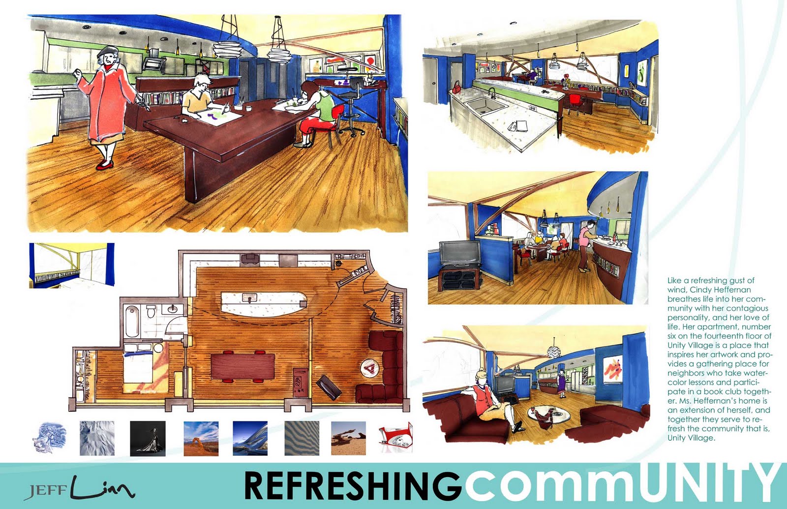
Like a refreshing gust of wind, Cindy Heffernan breathes life into her community with her contagious personality, and her love of life. Her apartment number six on the fourteenth floor of Unity Village is a place that inspires her artwork and provides a gathering place for neighbors who take watercolor lessons and participate in a book club together. Ms. Heffernan’s home is an extension of herself, and together they serve to refresh the community that is, Unity Village.
PROCESS TIMELINE
- Project assigned
- Brainstorming begins
- User needs are outlined and identified
- Breakdown of space diagramed
- Collection of images, information, search for inspiration
- SKETCH< SKETCH
- Floor plans and arrangement of space is explored
- Explore, and select materials, furnishings, etc.
- Once floor plan is solidified, elevation and walls are considered (put the fun, function, and concept together)
- Model the design in sketch up
- Review the entire space, go back over user needs and confirm that all needs are met.
- Once confidence is there, begin the rendering process….
- Continue rendering….
- Render some more…
- Keep rendering….
- Is the entire space represented? Oh crap, I need one more perspective…
- I guess I’ll render one more.
- Scan all images that have been created by hand.
- Begin to play with board layout options. (What all needs to be on the final presentation board? Does each element help or hurt the board? If is hurts, take it out! Is my concept easily read and felt based on my presentation?)
- Once I feel good about it, try to send it to be printed.
- It failed, try to send it again.
- Failed again, repeat the last step about 9 times for the next 4 or 5 hours.
- Give up on emailing the file and take it on a flash drive to the print shop.
- After 30 minutes of the print shop computer crashing a couple of times, get it printed, and FINALLY – PIN UP!
- Try to ignore the desire to feel a sense of accomplishment in being finished because you know you still have the process book to do.
- Sleep a few hours and then re-group, focus, and keep on truckin’
- Find your motivation in whatever form it may be, and move forward
- Run down the list of deliverables and pray to god that what you think you need to do and what is expected by the T.A. and the Teacher actually align.
- Once all proper requirements are represented, organize, arrange, and bind booklet.
- Turn in Final Process Booklet.
- Allow yourself to feel some sense of “Being Finished” and accomplishment. (But not too much because there is still a mystery assignment for the next week and a half…)
- BE PROUD OF WHAT YOU’VE DONE!!!
REFLECTION OF PROCESS
Wow, I can’t believe it’s over! Wait… is it over? I hope so, but it won’t feel like it until around may tenth or so. Anyways, to reflect on my process, and think back about the beginning of phase three and everything that has happened in between then and now it makes my head hurt. Then if I think back between now and phase two, phase one, and all of the work in between it makes me feel kind of nauseous. Honestly at this point I have a lot of feelings about the process. I feel burned out; proud of my work, happy it’s almost over, and nervous about my grade.
That being said, I feel very good about the work I have done, the things I have learned and the progress I have made this semester. I know I have learned some important lessons this year. The biggest lesson I have learned I think is how to work fast. This has mainly been out of necessity. Unlike most of my fellow classmates, I have a part time job, I am planning a wedding, and am a little older. Thus I have a different set of responsibilities and obstacles than most of the others. So when things get to crunch time with my assignments, I can honestly say that I have done the best of my abilities with my time management. And I can only hope for a good grade I suppose.
In the future I will probably do some things a little bit different. This time around I have done a lot better about documenting my process. But ultimately, I will just have to never say that I ‘just’ have to finish this or that. Because that little ‘just’ always seems to stretch into infinity.


Tuesday, April 20, 2010
Grinding it out
 So its the final week when everything is due. Unfortunately for me, I had to move last weekend which took up almost every free moment I had. Eventually I just had to get to the point where I just told myself to stop unpacking things and work on my project. At this point I have my sketchup model complete. I pulled line shots off my sketch-up model to help my renderings which I have 4 of the 5 I will use for my presentation board complete.
  Here is my sidekick who promised to stay up all night with me at around 3:45. He obviously couldn't make it, just looking at him made me even more tired. I thought while I was documenting my process, I should give Max credit where credit was due...
 These are my perspectives at the black-line point. Next up - color!
Wednesday, April 14, 2010
PROCESS PICS
 Action shot! Carlos almost made it in this one. This is when I was brainstorming on several floor plan layout options. The final cut list is below. I cicled the three I liked best and I'l be taking the strongest elements of these three layouts and combining them for my final design
 Given that my client teaches watercolor classes, I wanted to provide some double sided easles for her and her students to use, which i modeled below. Stephanie was kind enough to point out however that vertical easels are not the ideal way to paint watercolor given that the paint is so thin it will run all over the canvas if placed vertically. So I re-thought my plan and built a small model shown above of some built-in work stations that have a minimal angle for her students to use. I'm considering building them either into the wall below the windows in the main space or building them into the island. We'll see...

This is a gestural rendering of my large built-in wall shelving system for Ms. Heffernan's apartment. I tried to incorporate strong horizontal lines with some organic arch and fluid line forms. The idea is that the lower part will serve as storage units for books and other media, while the top area breaks up the wall space to alow for the showcasing of Ms. Heffernan and her student's paintings.
USER NEEDS
CINDY HEFFERNAN RESIDENCE
Allotted Space Breakdown:
- Social Space [ Studio, living room] - %40
- Kitchen - %20
- Bedroom - %20
- Bathroom - %10
- Storage - %10
Lifestyle Needs:
- Social Butterfly – Apartment must provide plenty of space for Cindy to entertain guests. Smaller bedroom is probably appropriate, as she does not seem spend much time in the bedroom except when she is sleeping. Natural light throughout the space should be maximized
- Painter/Teacher – Must have enough space for watercolor class sessions to happen. Also must have adequate wall space to display her personal work as well as her students work. Overall design and layout of the apartment should inspire her and her student’s art.
- Book Club Host – Plenty of comfortable seating should be provided. Seating arrangement should make it easy for a large group of people to interact and converse. (line of sight) Proximity of the seating area to the kitchen should be close so the snacks and refreshments for the guests can get to them easily. Foot traffic circulation should be fluid so guests feel comfortable.
PHASE THREE CONCEPT STATEMENT
Drawing on the characteristics of wind, apartment 6 on the 14th floor is a place that breathes a breath of fresh air into Ms. Heffernan’s life. Fluid movement and universal accessibility are key elements of both the look and layout of the apartment. Built-in shelving and artist work stations help create a space that is open and easily adaptable to the variety of uses Cindy needs in her home. The apartment provides an inspiring and comfortable place for her to live, work and entertain her many guests that also live in the Unity Village.
Monday, April 12, 2010
CHARESE ALLEN’S DESIGN STRENGTH
I had a talk with Charese about what exactly she considered her design strength to be. She told me that her strongest point as a designer was her ability to appeal to the senses in a design. She stated that she was able to identify what is needed and wanted by the senses of the user in her specific designs in order to design really well. I think this is a great way of looking at design; to really analyze exactly what the human user of a room, piece of furniture, or even a car needs in order to inform a design. While this is different from what I consider to be my design strength, I think it definitely applies to my design strength. I have a lot to learn from Charese. If I can analyze exactly what it is that I love about a specific painting or photograph, and then try to understand what exactly it is about it that appeals to each sense specifically, I will probably be a more successful in my designs. In general I think what Charese’s design strength speaks to is that as designers, we are almost always designing to the human scale. Designing for a human means we must get down to the core of what and how exactly behave, interact and respond. These simplified concepts can be applied to almost every design situation, and I’m sure I will build on these ideas in the future.
I had a talk with Charese about what exactly she considered her design strength to be. She told me that her strongest point as a designer was her ability to appeal to the senses in a design. She stated that she was able to identify what is needed and wanted by the senses of the user in her specific designs in order to design really well. I think this is a great way of looking at design; to really analyze exactly what the human user of a room, piece of furniture, or even a car needs in order to inform a design. While this is different from what I consider to be my design strength, I think it definitely applies to my design strength. I have a lot to learn from Charese. If I can analyze exactly what it is that I love about a specific painting or photograph, and then try to understand what exactly it is about it that appeals to each sense specifically, I will probably be a more successful in my designs. In general I think what Charese’s design strength speaks to is that as designers, we are almost always designing to the human scale. Designing for a human means we must get down to the core of what and how exactly behave, interact and respond. These simplified concepts can be applied to almost every design situation, and I’m sure I will build on these ideas in the future.
DESIGN STRENGTH
There are probably as many definitions of what it means to be a ‘Designer’ as there are people who would call themselves ‘Designers.’ This is because each ‘Designer’ has different strengths and weaknesses. I would have to say my biggest design strength, (or at least I hope,) is my ability to incorporate aesthetic beauty with form and function in my design work. One of the largest reasons I was attracted to the pursuit of a career as a ‘Designer,’ is the very idea that I could create things that not only work really well, but are also equally beautiful and vice versa. This way of thought stems from equal parts love of beautiful things and love of things that work extremely well. This way of thought and path of life are regarded by many people in a negative way in that I (or all ‘designers’ in general) are just “picky people.” While I understand how some people may feel this way, I also recognize the enormous impact that both good and bad design have on the entire world both positively and negatively respectively. I do not strive to create beautiful things that function well because I am a vein person, I do it because I truly believe beautiful things that work well make the world a better place.
Wednesday, April 7, 2010


USER EXPERIENCE
The following is a short narrative of user experience in Unity Village...
72 Year old man –
Gunther wheeled himself out of the elevator into the lounge hallway and smiled at a young girl who was reading on the built in bench. He paused for a moment and looked out the windows and breathed an easy sigh of slight relief. Noticing the clouds breaking apart and the sun starting to come through, he knew today was going to be a good day. He turned and continued around the hallway and headed to the fitness studio for his disabled aerobics class. Upon arriving at the fitness studio doors, Gunther was greeted by Amanda, the aerobics instructor.
42 Year old woman –
“Hi Gunther, glad to see you could make it today!” said Amanda. At 42 years old, and in the best shape of her life, Amanda was thrilled to get her job as the aerobics instructor in the brand new Unity Village building. She was new to the area and didn’t know many people in town. Having found this job opening online, she drew comfort from being able to work in the building full of diversity. The overwhelming sense of community that existed at Unity Village made her feel at home immediately. As Gunther moved over to his usual place in the room, Amanda asked, “Did you see my daughter on your way in?”
6 Year old girl –
Just then the door to the fitness studio burst open and the little girl from the lounge earlier came running in and yelling, “Mommy, can we get ice cream later!?” “Oh, maybe if you’re a good girl,” said Amanda as she ran her fingers through her daughter’s pig tails. “Gunther, this is my daughter Izzy,” said Amanda. “She’s so cute said!” said Gunther. Izzy smiled at him as she asked, “What’s your favorite color?” At that moment Gunther smiled and said “Blue of course!” Then he thought to himself, “Wow I honestly can’t remember the last time someone asked me that.” He paused and then realized how much he loved his new life at the Unity Village. The pace affected him like a cool breeze, a breath of fresh air, and at that moment the title of the building made perfect sense.
Friday, April 2, 2010
NEIGHBORHOOD C REVIEW
GROUND FLOOR-
The design of the ground floor presented by Carlos was very unique in both form and color. The most unique elements of the design were the columns. The work out equipment is integrated into the columns which I found to be a very strong point of the design. Integrated columns are a point that I could potentially adopt into my design. The biggest concern I have for the design of the first floor overall would be the layout.
FIRST FLOOR-
The design of the first floor done by Casandra and Hailey was based on a grid-like design. The concept was based on order and Chaos. I thought the color scheme was strong. However I though it strange that they chose to devote a third of their floor space to just the daycare, considering how small of a demographic children make up in the building. I also would not have devoted the southwest corner of the building to just storage, blocking a significant portion of the natural light that could be let into the space.
SECOND FLOOR –
This floor was designed by Wes, Vanessa, and Hailey. The concept and layout was based on oasis. This floor encompassed a cookery and garden, and focused on slow foods. I think it had a daycare as well which I though curious, as the first floor also had a day care. Overall I thought the format of the presentation was nice, however, a lot of the images were too small to see. I would have liked to see a large version of the floor plan to better understand the organization of space. Other than that I thought their project brought a different angle to Unity Village with the incorporating food into the design.
Monday, March 22, 2010
CITY LAKE PARK

City Lake Park is an inviting place that has a lot to offer the neighborhood. As it is a free, public property, local citizens as well as people from other parts of town take advantage of this hot spot. It offers a pool, rides for children, a boat dock with available row boats and fishing access as well as the large playground pictured here. Because of the free opportunity for recreation, City Lake Park pulls people together to share in the activities when the weather is nice. The abundance of things to do as well as many picnic shelters promote a comfortable atmosphere that results in total strangers interacting and talking to each other. The playground area pictured above is one of the best places at City Lake Park where connections are made between strangers and friends alike. This is usually caused by children playing together and ignoring many of the social barriers people tend to put up as they get older in life. As the children play together, parents often end conversing with each other as well. This simple place might have a lesson to offer the rest of the neighborhood that has even greater value than playtime when the weather is nice. Just imagine how different the world would be if adults could remain as carefree and playful spirited as they once were on the playground.
- Jeff Linn
- Jeff Linn
Friday, March 19, 2010
DESIGN THNKING
What does design thinking mean to you?
How are you using it in your current project?
Future projects?
Design thinking honestly means quite a bit to me. For years I have been saying that the world’s most valuable resource and final frontier is the creative thought processes of the human mind. With so many advances in technology, it seems like most jobs that people have can easily be replaced by computers. Technical service calls from America are directed to operators in India. The furniture industry which used to have the majority of its roots in North Carolina are now shipped out to China. These changes have happened as the result of two main things: money and technology. These changes have shifted the way the business world operates and forces those who wish to still have a job in a local market to come up with new ways to succeed. The point I am getting at is that our generation has a new set of challenges to face if we wish to succeed as designers. With new challenges, we must come up with new solutions. This is where the importance of design thinking comes into play.
As designers we have a talent or a skill to have an eye for great color pallets, material choices, and organization of space. This is only the surface. The reason great designers can come up with great designs ultimately has to do with solid creative problem solving skills. The same creative problem solving skills and processes we use to design a hotel lobby can be applied to any other problems in life in order to achieve good results. So to tie back to what I was talking about in the beginning about the value of the creative thought processes of the brain, we must apply our knowledge and skills of design thinking to attack greater problems. This is relative to the “We Hatch Ideas” presentation we had in class on Wednesday. It is my underlying goal to use design thinking in innovative ways to develop my personal career as well as help larger social problems.
I have been using design think in my current project to help develop our concept and through every step of the process. Our group collectively worked together to complete our programming documents. We used creative thinking to account for all of the needs that Unity Village will have to provide. At this point Felicia and I are using our collective creative thought processes to come up with a floor plan and look that fulfills all of the requirements in a way that is aesthetically beautiful.
My use of design thinking will be incorporated in all work that I do from here on out. As I mentioned earlier, I plan on using my creative thought processes in innovative ways to advance my personal work, as well as to inspire change.
Unity Village Design Development - INSPIRATION


1. http://www.wsu.edu/~kimander/teraray.htm
2. http://www.oceanlight.com/lr/tran/18000.jpgtran/18000.jpg
3. http://www.apartmenttherapy.com/images/uploads/at46fd59a43d9eb8.10470593.jpgcom/images/uploads/at46fd59a43d9eb8.10470593.jpg
4. http://www.muranowalls.com.au/huntershill.htmlhuntershill.html
5. http://www.oneinchpunch.net/wordpress/wp-content/uploads/2007/07/funky-fish-tank-1.jpgwordpress/wp-content/uploads/2007/07/funky-fish-tank-1.jpg
6. http://www.bestclassicfurniture.com/photo%20of%20modern%20furniture/unique_2900_2.jpgbestclassicfurniture.com/photo%20of%20modern%20furniture/unique_2900_2.jpg
7. http://www.oneinchpunch.net/wordpress/wp-content/uploads/2007/07/funky-fish-tank-2.jpgwordpress/wp-content/uploads/2007/07/funky-fish-tank-2.jpg
8.
9. http://www.inhabitat.com/2008/10/22/the-bright-idea-light-bulb-shade/
10.
11.http://common.csnstores.com/common/collections/IIT/Alvar%20Aalto/016.jpg
12.http://www.therugcompany.info/designer-collection/paul-smith/brown-swirl.htm
13.http://www.virginmedia.com/images/summer-athletics-fitness-431.jpg
14.http://www.notcot.org/tag/architecture/page/21/
15.http://www.notcot.org/tag/architecture/page/36/
16.http://notbeige.files.wordpress.com/2009/07/a-shelf-in-the-wind2.jpg
17.http://www.cyprusbyclick.com/CITY_GUIDE/IMG/cyprus-gallery/Windswept-Tree-at-Agious-Georgious.jpg
18.http://aqua-velvet.com/2009/11/eero-saarinen-part-1/
19. http://www.furniturestoreblog.com/2009/01/10/wallpaper_home_furnishings_and_interior_design_award_winners.html
20.http://www.inhabitat.com/2009/04/02/abu-dhabis-spiraling-helix-hotel/
Unity Village Design Development - CONCEPT STATEMENT
Wind is invisible yet powerful enough to shape stone. Like the winds moving across the earth pulling from different areas and flowing together, the Unity Village pulls together diverse occupants in a fluid way that will refresh and uplift its tenants by utilizing open and airy design. The design layout of Unity Village intertwines the lives of its diverse tenants in positive ways that are not always physically visible, yet its community enhancing effects are obvious.
Unity Village Design Development - STANDARDS
MULTIPURPOSE ROOM
 *from Time-Saver Standards For Interior Design And Space Planning, DeChiara, Panero and Zelnik. 1991. p.313
CHILD CARE CENTER
 *from Designing A Day Care Center, E. Belle Evans, Saia, Elmer A. Evans. 1974. p. 3
 *from Recommendations For Child Care Centers, Moore, Lane, Hill, Cohen, McGinty. 1979. P.409
WORKOUT ROOM STANDARDSSource: Sawyer, Thomas.(2005). Facility Design and Management: for Health, Fitness, Physical Activity, Recreation, And Sports Facility Development.(pp.366-379). Illinois: Sagamore Publishing, L.L.C.
 *from Time-Saver Standards For Interior Design And Space Planning, DeChiara, Panero and Zelnik. 1991. p.1107
LOUNGE
 *from Time-Saver Standards For Interior Design And Space Planning, DeChiara, Panero and Zelnik. 1991. p.313
CHILD CARE CENTER
 *from Designing A Day Care Center, E. Belle Evans, Saia, Elmer A. Evans. 1974. p. 3
 *from Recommendations For Child Care Centers, Moore, Lane, Hill, Cohen, McGinty. 1979. P.409
WORKOUT ROOM STANDARDSSource: Sawyer, Thomas.(2005). Facility Design and Management: for Health, Fitness, Physical Activity, Recreation, And Sports Facility Development.(pp.366-379). Illinois: Sagamore Publishing, L.L.C.
·Air temperature keep constant, between 68-72 degrees
· Need double wide entrance
· lighting 50-100 foot-candles
· Wooden floors common
· Need storage area for equipment
· Need mirrors, but don’t overuse
-General: Source: Chiara, J., Panero, J. & Zelnik, M.(2001). Time-Saver Standards For Interior Design and Space Planning. (pp.675-729) New York : McGraw-Hill
· Incandescent or fluorescent lights recommended
· 3’-0” center distance b/w toilets
· 3’-1 1/2” center distance from sink to left/right structural wall
· 2’-2” Center to center for sinks· 2’-6” center distance from sink to center urinal
· 1’-7 1/2 “ center toilet to right/left structural wall
· 2’-0” Urinals center to center· 2’-0” deep partition wall to separate urinal space from others
· 4’-9” wide partition side walls· 2’-8” to 3’-0” width partitions
· 4’-8” to 5’-0” deep partitions
· 3’-4” AFF general trash can· 6’-6” AFF recessed towel cabinet and waste receptacle
· 3’-8” AFF soap dispenser
· 2’-7” AFF sinks mounted
· 6’-6” AFF feminine product dispenser
· 6’-0” AFF Mirror mount
· 6’-6” AFF Vanity light mount
· 2’-6” AFF vanity top· 6” vanity backsplash
· 2’-6” AFF toilet paper dispenser location
· 2’-9” toilet paper dispenser from back wall
· 3’-4” min walkways· 3’-0” doorway
· 5’-10” AFF min to top of stall door
· 7’-5” AFF total stall heightBuilding Type / Water Closets / Urinals
Lavatories / Drinking Fountains / Other Fixtures
-Handicap:
· 2’-3” to bottom edge of sink
Lavatories / Drinking Fountains / Other Fixtures
-Handicap:
· 2’-3” to bottom edge of sink
· 2’-5” AFF min, 2’-8” preferred, 2’-10” max to sink top
· 9” toe space at sink· 8” min. knee space area at sink
· 17” min. sink sits out from wall
· 5’-4” AFF paper towel dispenser
· 2’-6” toilet paper dispenser from structural wall
· 3’-4” to bottom of handicap mirror
· 3’-0” clearance into stall
· 4’-8” min stall depth
· 3’-6” grab bar recommended in stall 12” for back wall
· 2’-9” AFF grab bar
· 2’-0” grab bar centered behind toilet
· 2’-0” AFF toilet paper dispenser, 3’-6” from back wall
· 2’-0” AFF toilet paper dispenser, 3’-6” from back wall
· 1’-6” toilet from structural wall
· 1’-6” AFF to top of toilet
· 3’-3 to 4” AFF to center for feminine dispenser and paper towel dispenser, to bottom of soap dispenser
· 5’-0” wide Barrier free partition
· 4’-11” deep partition interior
· 3” stall door hinged from structural wall
· 2’-10” wide stall door
· 5’-0” clear floor so wheel chair can turn 360 degrees
· 2’-6” X 4’-0” clear floor space from center sink out
Source: Chiara, J., Panero, J. & Zelnik, M.(2001). Time-Saver Standards For Interior Design and Space Planning.(p.1469) New York : McGraw-Hill
JANITOR CLOSET STANDARDS
Source: Chiara, J., Panero, J. & Zelnik, M.(2001). Time-Saver Standards For Interior Design and Space Planning.(pp.675-729) New York : McGraw-Hill
· 2’-0” min from sink center to right & left structural walls· 5’-8” AFF broom rack· sloped floor with drain
FITNESS CENTER STANDARDS
Source: Sawyer, Thomas.(2005). Facility Design and Management: for Health, Fitness, Physical Activity, Recreation, And Sports Facility Development.(pp.366-379). Illinois: Sagamore Publishing, L.L.C.
· Tallest machine & equipment along walls, smaller machines in middle· Weight mahines + apparatus at least 2’-0” from each other & suggested 3’-0” apart.
· Platform spaces need to have good overhead clearance, at least 12’-0”· 3’-0” clear pathways always
· equipment 6” from mirrors· mirrors 20” AFF
· group equipment into organized priority sections
· 20-25 sq ft for each user of the equipment· 20-40 sq ft for each machine· flooring materials: shock absorbing, 0.5-.07 friction DIN Standard, needs to maintain a rolling load
· 12’-0” ceiling height min. in free weight area, 10’-0” in strength training area
· lighting 50-100 foot-candles
· machines are 120V/20AMPS
· need NEMA 5-20 receptacles
· Air temperature keep constant, between 68-72 degrees
· Ventilation needs to provide 8-10 air exchanges per hour
· Need double wide entrance· At least 220V outlets for maintenance equipment
· Children under 14yrs old must be with adult
· Signage addressing user maintenance, safety, and who to reference for help
Wednesday, March 3, 2010


Wednesday, February 17, 2010
My Sister's House
The Urban Studio project 'My Sister's House' was wrapped up Monday with an open house and reception. While I was unable to stay for the ribbon cutting ceremony, I could tell that there was definitely a lot of buzz about the building on Monday. Walking around and looking at the place, it was obvious that a lot of people must have put a lot of work into its design and construction. It is really great to see a project of such a large scale come from the UNCG IARC program. The building had a very modern look and some very un-traditional details to it. Some examples included the irregular sized and placed windows as well as polished concrete floors throughout the building. There were a few details that I will be interested to see how they are adapted to living with an infant. Particularly the challenge of how to child proof the cabinets and protect the concrete floors to avoid serious bruises from falling when a child is learning to walk. Ultimately I think My Sister's House is a wonderful achievement that will be talked about for a long time.
Sunday, February 14, 2010
Friday, February 12, 2010
MAKESHIFT SHELTER PROCESS
From the time the ‘Makeshift Shelter’ project was assigned, I could tell that everyone involved was excited about the work that had to be done. For starters, following a semester where the studio work revolved largely around programming documents, sketching and rendering, this assignment was a breath of fresh air. That’s not to say that there is anything wrong with only programming and rendering. I definitely learned and grew a lot last semester, but I have always truly loved working in three dimensions and building things with my hands. I feel that this project was a nice exercise of designing and then moving straight into building.
Given that the task or activity that our shelter had to perform was to be a ‘Shelter for socializing,’ our team (the red team: Wes, Clarissa, Hailey and myself) began by throwing out and writing down descriptor words of what exactly this shelter must do in order to be a good structure for socializing. Comfortable, easy line of sight and easy accessibility from approaching people where among the list of qualities we knew the makeshift shelter must embody.
I can definitely say that describing what we wanted our structure to do was a lot easier than trying to figure out how exactly to take the list of descriptors and create a place made of no more than five materials and no more than two binding agents. My biggest challenge from a design standpoint was figuring out how to make a structure that not only fit within the small footprint that we were given in the Gatewood lobby, but would also be suitable for socializing. As our group discussed the challenges before us, we concluded that to ‘socialize’ there needs to be at least three people involved. Two people hanging out is more like a date, or more personal. Thus, at least three people must get together to really be socializing. And of course, as the saying goes when it comes to a party, the more the merrier! Our group chose to address this challenge by designing a structure that would be open in some way on all sides, leaving it approachable by any one who wanted to ‘socialize’ from any angle.
Once we identified clearly the needs and parameters surrounding the shelter, we each sketched out what we thought it should look like and how it might actually work. My role in this process was to suggest some materials that I knew would be easy to get our hands on, and would work structurally. I took some scrap corrugated cardboard and made a small test model of what our potential columns could be made of. By showing it to the rest of the group, I convinced everyone that this would be a viable option for the use of the main structural skeleton of our shelter. The system I was working of consisted simply of a large rectangle of cardboard that is scored twice and then rolled into a triangle. It is then wrapped with plastic wrap. The natural characteristic of the cardboard made it want to unroll, thus keeping a constant, tight pressure on the plastic wrap, holding the column together.
With a building system in place we moved into refining and making decisions on overall size based on our footprint limitations. From the interior we based decisions on how much space we had and needed, relative to the human scale. Taking inspiration from a gazebo I saw on the campus of Elon College, we loosely based our structure on the idea of an open shelter with seating that had two openings, and was approachable from all sides. I made a rough model in sketchup, and the rest of the group used that to create our physical scale model.
With the scale modeling phase complete, we began construction of the beast. Before beginning construction, we all collected massive amounts of corrugated cardboard, plastic wrap, fabric and twine. Hailey were working on the fabric walls while Clarissa and I made the columns. I definitely hit a point after making a few columns where I had a lot of doubts as to whether this thing would actually stand up. I knew that worrying about it wouldn’t help so I just kept building and decided that I would address the structural problems as they came. I can definitely say that working on scale models robs you of quite a bit of reality of the challenges faced when working at full scale.
Ultimately with a lot of trial and error, we completed the shelter almost exactly the way we intended to. We did decide to leave off a bench, but other than that I have to say the whole thing was a success. I enjoyed this project and feel that it broadened the way I think about how to use materials’ strengths together in simply ways for a positive result.
Wednesday, February 10, 2010
Housing and Community Response
This chapter was interesting and packed with information. I have always wondered how all of the inner workings of local government organized housing and community. In terms of a reaction to this chapter, I have to say that I feel pretty overwhelmed by how much information was embedded in the writing. I guess in a way its nice to know that there are so many people and so much thought put into the issues of housing. Also, I definitely appreciate that if I was in a situation where I wanted to dispute something, there is actually an outlet for my voice to be heard. From my experience, the process of dealing with the local government to resolve an issue related to zoning and housing can be a tedious one.
Last summer, I was hired to do an architectural rendering for a homeowner in a historic district neighborhood. The homeowner had a small one level house with a small front porch that he wanted to enclose with a screened porch. Taking the proper steps, he and his builder contacted the city to get his permit. This put him in touch with a gentleman named Mike Cowhig with the city of Greensboro’s Historic District. Mike told the homeowner that he needed drawings of what the proposed porch would look like so he and the committee could give a thumbs up of down to the project. The city’s main concern was that the porch would be keeping in the look and style of the Historic District. Apparently, this tiny little porch was actually a really big deal because up till then, no one had ever been allowed to add a screened porch in the neighborhood. If the homeowner’s porch was approved, the city knew it would become the catalyst for multiple other people wanting to do the same things to their houses.
This is how I fit in the picture… The homeowner had already contacted an architect about the project, and the architect wanted a thousand dollars to do the drawing. Trying to avoid the high cost, the homeowner asked Mike at the City of Greensboro if he knew of a cheaper option. Mike contacted my Dad, who is an architect to see if he knew of any one who could do it for cheaper. My Dad suggested me since all they really needed was a rendering. Luckily for me I learned a lot in Suzanne’s drawing class last year, so I was up to the task. I had a meeting on the site with the homeowner, the builder, and two city representatives about how the project would look. After much deliberation between all parties involved, we all reached a decision on what would be done. Then I came up with the rendering which was turned in to the City of Greensboro. The drawing showed what was needed and the porch was approved. Honestly I felt bad for the homeowner who went through so much just to have a screened porch built!
Friday, February 5, 2010


History
-During World War II, the Chicago Housing Authority began building a low rise apartment project for war workers.
-The original population of Cabrini Green reflected the area’s past ethnic mix of poor Italians, Irish, Puerto Ricans, and African Americans living among the war workers and veterans.
-The Chicago Housing Authority failed to budget money to repair buildings and maintain landscaping as they deteriorated causing horrible conditions with vermin and worsening of the structures.


-Cabrini-Green's reputation for crime and gangs rivaled the former inhabitants’ of what was commonly known as “Little Hell.”
“Over the year, the resident leaders have volunteered for any and all programs to improve the conditions at Cabrini Green in effort to ensure its continued existence. They formed local advisory council.” Larry Bennett, Janet L. Smith, and Patricia A. Wright, Where are Poor People to Live? The case of Cabrini-Green , Patricia A. Wright and Richard M. Wheelock and Carol Steel, New York, 2006
-Increasing real-estate values in the later twentieth century led housing officials to propose replacement of the complex from low income housing to mix income homes community. Pricing between $200,000 to $500.000.

-This was the largest demolition of public housing in American history and it uprooted around 40,000 who had never lived anywhere but in public housing.
-Chicago Housing Authority announces Plan for Transformation, which will spend $1.5 billion over ten years to demolish 18,000 apartments and build or rehabilitate 25,000 apartments.
-Earlier redevelopment plans for Cabrini-Green are included in the Plan for Transformation. New library, rehabilitated Seward Park, and new shopping center open.

CommUNITY Social Case Study: Cabrini Green
-Currently there are only around 4,700 residents living in Cabrini Green, displacing the other 35,000.
-During the 1970’s American sitcom “Good Times,” was patterned after the infamous Cabrini Green to bring attention to poverty in a comedic way, with art work by famed artist, Ernie Barnes.
How Cabrini Green Fosters CommUNITY
How was it successful?
The community garden near Cabrini Green is used by only a few families from the complex but it has the potential to greatly foster community amongst the residents. It is open to all the communities near it and allows for more interaction among these different communities.
The community tutoring and mentor connections create community by bringing together mentors and mentees. The mentors from outside of the community use their other social connections to help bring other people together as more mentors and people who will do other things for the community.
How was it unsuccessful?
In the 1960’s the housing failed to foster community due to racial segregation among the multiple races inhabiting Cabrini Green
Allowing the buildings to go into disrepair, dereliction and infestation of rodents.
http://www.encyclopedia.chicagohistory.org/pages/199.html
http://www.cbsnews.com/stories/2002/12/11/60II/main532704.shtml
www.terryswafford.com/Recent%20Paintings/Cabr...
konroy9.deviantart.com/art/Cabrini-Green-Mura...
http://www.greenrightnow.com/wabc/2009/07/20/a-garden-oasis-erupts-from-chicagos-cabrini-green-asphalt/
http://www.cbsnews.com/stories/2002/12/11/60II/main532704.shtml
yochicago.com/.../6945/
Subscribe to:
Posts (Atom)
