Wednesday, April 28, 2010

This is a design that makes me VERY happy. This is a picture of a Warwick Dolphin Pro I Bass that is the same model that I have owned and played for 8 and a half years. I have played literally hundreds of bass guitars in the course of my life, and I have yet to play one that I feel has been better designed than this one. Obvious masterfull craftsmanship are demonstrated throughout evry minute detail of this instrument. For example, the body of the bass actualy curves to fit the contour of your body so it is more comfortable to play. The frets are made of the same bronze used to make bells to increase resonance of the stringas and increase tone depth and sustain. I could talk for days about why this is an example of excellence in design. I could talk for even longer about why exactly this design make me happy. Mostly, this is the one designed object that I have in my life that inspries me every time I pick it up, and I notice something new to appreciate about it every time I play it.

This is a picture of a Fender Precision Bass. I own a mexican version of this bass, which was my very first bass. While I truly love this instrument, I can also say that there are many things about this design I would LOVE to change. I will never sell or get rid of this bass, but at the same time, I definitely plan on making some improvements to the design at some point. This was the original design of the first electric bass guitar that was developed in the early 50's by Leo Fender. It was a design that changed the chape of music forever, and layed the foundation for an eternity of Electric Bass musicians. Since its design, it many other basses have been designed and created, but with out this one, none of the others would exist.

Friday, April 23, 2010

PRESENTATION BOARD


PRESENTATION BOARD STATEMENT

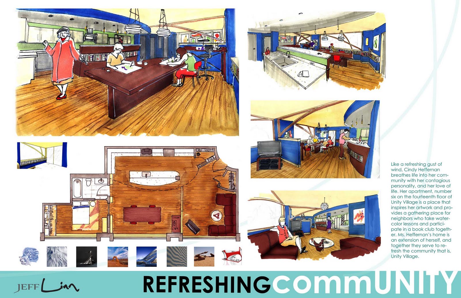
Like a refreshing gust of wind, Cindy Heffernan breathes life into her community with her contagious personality, and her love of life. Her apartment number six on the fourteenth floor of Unity Village is a place that inspires her artwork and provides a gathering place for neighbors who take watercolor lessons and participate in a book club together. Ms. Heffernan’s home is an extension of herself, and together they serve to refresh the community that is, Unity Village.

PROCESS TIMELINE

- Project assigned
- Brainstorming begins
- User needs are outlined and identified
- Breakdown of space diagramed
- Collection of images, information, search for inspiration
- SKETCH< SKETCH- Concept revisited, reformed and solidified
- Floor plans and arrangement of space is explored
- Explore, and select materials, furnishings, etc.
- Once floor plan is solidified, elevation and walls are considered (put the fun, function, and concept together)
- Model the design in sketch up
- Review the entire space, go back over user needs and confirm that all needs are met.
- Once confidence is there, begin the rendering process….
- Continue rendering….
- Render some more…
- Keep rendering….
- Is the entire space represented? Oh crap, I need one more perspective…
- I guess I’ll render one more.
- Scan all images that have been created by hand.
- Begin to play with board layout options. (What all needs to be on the final presentation board? Does each element help or hurt the board? If is hurts, take it out! Is my concept easily read and felt based on my presentation?)
- Once I feel good about it, try to send it to be printed.
- It failed, try to send it again.
- Failed again, repeat the last step about 9 times for the next 4 or 5 hours.
- Give up on emailing the file and take it on a flash drive to the print shop.
- After 30 minutes of the print shop computer crashing a couple of times, get it printed, and FINALLY – PIN UP!
- Try to ignore the desire to feel a sense of accomplishment in being finished because you know you still have the process book to do.
- Sleep a few hours and then re-group, focus, and keep on truckin’
- Find your motivation in whatever form it may be, and move forward
- Run down the list of deliverables and pray to god that what you think you need to do and what is expected by the T.A. and the Teacher actually align.
- Once all proper requirements are represented, organize, arrange, and bind booklet.
- Turn in Final Process Booklet.
- Allow yourself to feel some sense of “Being Finished” and accomplishment. (But not too much because there is still a mystery assignment for the next week and a half…)
- BE PROUD OF WHAT YOU’VE DONE!!!


REFLECTION OF PROCESS

Wow, I can’t believe it’s over! Wait… is it over? I hope so, but it won’t feel like it until around may tenth or so. Anyways, to reflect on my process, and think back about the beginning of phase three and everything that has happened in between then and now it makes my head hurt. Then if I think back between now and phase two, phase one, and all of the work in between it makes me feel kind of nauseous. Honestly at this point I have a lot of feelings about the process. I feel burned out; proud of my work, happy it’s almost over, and nervous about my grade.
That being said, I feel very good about the work I have done, the things I have learned and the progress I have made this semester. I know I have learned some important lessons this year. The biggest lesson I have learned I think is how to work fast. This has mainly been out of necessity. Unlike most of my fellow classmates, I have a part time job, I am planning a wedding, and am a little older. Thus I have a different set of responsibilities and obstacles than most of the others. So when things get to crunch time with my assignments, I can honestly say that I have done the best of my abilities with my time management. And I can only hope for a good grade I suppose.

In the future I will probably do some things a little bit different. This time around I have done a lot better about documenting my process. But ultimately, I will just have to never say that I ‘just’ have to finish this or that. Because that little ‘just’ always seems to stretch into infinity.


PERSPECTIVES


Tuesday, April 20, 2010

Grinding it out

So its the final week when everything is due. Unfortunately for me, I had to move last weekend which took up almost every free moment I had. Eventually I just had to get to the point where I just told myself to stop unpacking things and work on my project. At this point I have my sketchup model complete. I pulled line shots off my sketch-up model to help my renderings which I have 4 of the 5 I will use for my presentation board complete.


Here is my sidekick who promised to stay up all night with me at around 3:45. He obviously couldn't make it, just looking at him made me even more tired. I thought while I was documenting my process, I should give Max credit where credit was due...

These are my perspectives at the black-line point. Next up - color!

Wednesday, April 14, 2010

PROCESS PICS

Action shot! Carlos almost made it in this one. This is when I was brainstorming on several floor plan layout options. The final cut list is below. I cicled the three I liked best and I'l be taking the strongest elements of these three layouts and combining them for my final design


Given that my client teaches watercolor classes, I wanted to provide some double sided easles for her and her students to use, which i modeled below. Stephanie was kind enough to point out however that vertical easels are not the ideal way to paint watercolor given that the paint is so thin it will run all over the canvas if placed vertically. So I re-thought my plan and built a small model shown above of some built-in work stations that have a minimal angle for her students to use. I'm considering building them either into the wall below the windows in the main space or building them into the island. We'll see...


This is a gestural rendering of my large built-in wall shelving system for Ms. Heffernan's apartment. I tried to incorporate strong horizontal lines with some organic arch and fluid line forms. The idea is that the lower part will serve as storage units for books and other media, while the top area breaks up the wall space to alow for the showcasing of Ms. Heffernan and her student's paintings.


USER NEEDS

CINDY HEFFERNAN RESIDENCE

Allotted Space Breakdown:

- Social Space [ Studio, living room] - %40
- Kitchen - %20
- Bedroom - %20
- Bathroom - %10
- Storage - %10

Lifestyle Needs:

- Social Butterfly – Apartment must provide plenty of space for Cindy to entertain guests. Smaller bedroom is probably appropriate, as she does not seem spend much time in the bedroom except when she is sleeping. Natural light throughout the space should be maximized

- Painter/Teacher – Must have enough space for watercolor class sessions to happen. Also must have adequate wall space to display her personal work as well as her students work. Overall design and layout of the apartment should inspire her and her student’s art.

- Book Club Host – Plenty of comfortable seating should be provided. Seating arrangement should make it easy for a large group of people to interact and converse. (line of sight) Proximity of the seating area to the kitchen should be close so the snacks and refreshments for the guests can get to them easily. Foot traffic circulation should be fluid so guests feel comfortable.

PHASE THREE CONCEPT STATEMENT

Drawing on the characteristics of wind, apartment 6 on the 14th floor is a place that breathes a breath of fresh air into Ms. Heffernan’s life. Fluid movement and universal accessibility are key elements of both the look and layout of the apartment. Built-in shelving and artist work stations help create a space that is open and easily adaptable to the variety of uses Cindy needs in her home. The apartment provides an inspiring and comfortable place for her to live, work and entertain her many guests that also live in the Unity Village.

Monday, April 12, 2010

CHARESE ALLEN’S DESIGN STRENGTH

I had a talk with Charese about what exactly she considered her design strength to be. She told me that her strongest point as a designer was her ability to appeal to the senses in a design. She stated that she was able to identify what is needed and wanted by the senses of the user in her specific designs in order to design really well. I think this is a great way of looking at design; to really analyze exactly what the human user of a room, piece of furniture, or even a car needs in order to inform a design. While this is different from what I consider to be my design strength, I think it definitely applies to my design strength. I have a lot to learn from Charese. If I can analyze exactly what it is that I love about a specific painting or photograph, and then try to understand what exactly it is about it that appeals to each sense specifically, I will probably be a more successful in my designs. In general I think what Charese’s design strength speaks to is that as designers, we are almost always designing to the human scale. Designing for a human means we must get down to the core of what and how exactly behave, interact and respond. These simplified concepts can be applied to almost every design situation, and I’m sure I will build on these ideas in the future.

DESIGN STRENGTH

There are probably as many definitions of what it means to be a ‘Designer’ as there are people who would call themselves ‘Designers.’ This is because each ‘Designer’ has different strengths and weaknesses. I would have to say my biggest design strength, (or at least I hope,) is my ability to incorporate aesthetic beauty with form and function in my design work. One of the largest reasons I was attracted to the pursuit of a career as a ‘Designer,’ is the very idea that I could create things that not only work really well, but are also equally beautiful and vice versa. This way of thought stems from equal parts love of beautiful things and love of things that work extremely well. This way of thought and path of life are regarded by many people in a negative way in that I (or all ‘designers’ in general) are just “picky people.” While I understand how some people may feel this way, I also recognize the enormous impact that both good and bad design have on the entire world both positively and negatively respectively. I do not strive to create beautiful things that function well because I am a vein person, I do it because I truly believe beautiful things that work well make the world a better place.

Wednesday, April 7, 2010

Additional Material


UNITY VILLAGE - Second floor presentation


DIMENSIONED FLOOR PLAN


USER EXPERIENCE

The following is a short narrative of user experience in Unity Village...


72 Year old man –

Gunther wheeled himself out of the elevator into the lounge hallway and smiled at a young girl who was reading on the built in bench. He paused for a moment and looked out the windows and breathed an easy sigh of slight relief. Noticing the clouds breaking apart and the sun starting to come through, he knew today was going to be a good day. He turned and continued around the hallway and headed to the fitness studio for his disabled aerobics class. Upon arriving at the fitness studio doors, Gunther was greeted by Amanda, the aerobics instructor.

42 Year old woman –

“Hi Gunther, glad to see you could make it today!” said Amanda. At 42 years old, and in the best shape of her life, Amanda was thrilled to get her job as the aerobics instructor in the brand new Unity Village building. She was new to the area and didn’t know many people in town. Having found this job opening online, she drew comfort from being able to work in the building full of diversity. The overwhelming sense of community that existed at Unity Village made her feel at home immediately. As Gunther moved over to his usual place in the room, Amanda asked, “Did you see my daughter on your way in?”

6 Year old girl –

Just then the door to the fitness studio burst open and the little girl from the lounge earlier came running in and yelling, “Mommy, can we get ice cream later!?” “Oh, maybe if you’re a good girl,” said Amanda as she ran her fingers through her daughter’s pig tails. “Gunther, this is my daughter Izzy,” said Amanda. “She’s so cute said!” said Gunther. Izzy smiled at him as she asked, “What’s your favorite color?” At that moment Gunther smiled and said “Blue of course!” Then he thought to himself, “Wow I honestly can’t remember the last time someone asked me that.” He paused and then realized how much he loved his new life at the Unity Village. The pace affected him like a cool breeze, a breath of fresh air, and at that moment the title of the building made perfect sense.

Friday, April 2, 2010

NEIGHBORHOOD C REVIEW

GROUND FLOOR-

The design of the ground floor presented by Carlos was very unique in both form and color. The most unique elements of the design were the columns. The work out equipment is integrated into the columns which I found to be a very strong point of the design. Integrated columns are a point that I could potentially adopt into my design. The biggest concern I have for the design of the first floor overall would be the layout.

FIRST FLOOR-

The design of the first floor done by Casandra and Hailey was based on a grid-like design. The concept was based on order and Chaos. I thought the color scheme was strong. However I though it strange that they chose to devote a third of their floor space to just the daycare, considering how small of a demographic children make up in the building. I also would not have devoted the southwest corner of the building to just storage, blocking a significant portion of the natural light that could be let into the space.

SECOND FLOOR –

This floor was designed by Wes, Vanessa, and Hailey. The concept and layout was based on oasis. This floor encompassed a cookery and garden, and focused on slow foods. I think it had a daycare as well which I though curious, as the first floor also had a day care. Overall I thought the format of the presentation was nice, however, a lot of the images were too small to see. I would have liked to see a large version of the floor plan to better understand the organization of space. Other than that I thought their project brought a different angle to Unity Village with the incorporating food into the design.