SCALE in my opinion, is perhaps the greatest factor in deciding what and how to design or build anything. Above are a couple of images of scale people I drew along with a scale from the plan view of my piece of furniture. While I believe it is usually the most important factor, I also feel it isn’t always the most obvious factor in a design. Just imagine how different every aspect of the world we know would be if the average human height was 1 ½ feet less or 1 ½ feet more than it is now. A foot and a half isn’t much, but I feel confident the world would look very different it you changed the human scale by that small of a degree. The massive power of the ancient structures such as the Great Pyramid at Giza and Hatshepsut’s Temple wouldn’t come across the same way if they were built at a small scale, their large scale gives us a big hint to their great importance. As Blakemore says in regards to the relationship between social hierarchy and furniture on page 13, “In particular, the size and stature of the people affected chair design.”

UNITY is a word that has broad meaning to me, which also made it hard for me to illustrate. The more I looked at and thought about the Greek structures, the more the column stood out to me as what truly symbolizes unity. Our whole lives we have seen images of ancient Greek structures with these massive columns still standing after thousands of years. And yet in present day construction of college buildings and government buildings alike, the presence of columns still show through, unifying the past and present while segwaying into the future of important structures. Blakemore points this out on page 28 when he says, “Subsequently, derivations from ancient Greece and Rome in different periods of interior architecture have included… the structural use of the column, among others.”

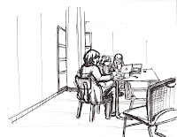
BOUDARIES play a role in design in more ways than one. For example, obvious literal boundaries exist in things such as the wall that surrounds the Acropolis and even the Agora, an area near the Acropolis as Roth says on page 222, “who’s boundaries were defined by the surrounding houses and public buildings.” Also natural boundaries were created But in another sense, I have learned how when drawing a scene, the lack of an obvious boundary can effectively be turned into a dynamic way to create a boundary in itself. This drawing of Suzanne and her TA’s shows how deciding where the lines in the walls end serve as a good boundary for the image without an obvious solid border.

SECTIONS are used in many ways in design. In the literal sense when applied to drafting, this section view shows a “sliced” section of Pat’s piece of furniture so the viewer can better understand what is happening. The great columns had to be made in sections as Roth says on pages 242 and 243, “Each component block or column drum, each piece of narrative sculpture was crafted to perfection.” In another sense, section is applied in the ancient Greek architecture through the use of the porch, the court and the hearth. These sections each fulfilled a purpose for the way their society functioned. The Greeks went on to repeat these sections throughout their structures which resonated throughout architecture from their time on.

VIGNETTES are used to illustrate small scenes in a way that is easy to understand and pleasing to the eye. In this example I chose to draw the same scene twice and also incorporate multiview into these vignettes. By simply changing the choice of angle, color and color placement, these two images can portray two totally different feels. The use of all of these tools together become a large and powerful part of the way architecture works and how effective all designs are.


No comments:
Post a Comment