Wednesday, February 25, 2009
VOICES
This pen and ink and water color picture I did of the Foust building shows a powerful look at the PRESENCE that can be felt from of the front of the building. This particular image was inspired by the work of Greg Capullo and Todd McFarlane in a Spawn comic book. While this image is especially dark and dangerous in feel, it doesn’t really represent the presence that is always felt by the building, just one of the many moments that happen with this building. The Foust building’s PRESENCE is almost impossible not to feel any time you walk from the Gatewood building to the EUC. This is largely caused by the small valley set in front of the building as well as its long. and kind of panoramic qualities. The architects of Medieval architecture knew about the importance of presence relative to the presence of light in their structures. As Roth says on page 330 about the writings of Dionysius, “Such Passages suggest that this pure, heavenly radiance could be simulated through an analogy to earthly light.
Light is a very important feature in the building I am studying for my PRECEDENT analysis. The use of light as the implied presence of God is demonstrated also as an interesting example of how the precedent of past temples served as the inspiration for this building. It was Wright’s intention in the design to capture the powerful simplicity that was ever present in the many examples of ancient religious structures. I thought the use of very high windows to cast a symbolic “light from the heavens” was very effective in his building. The Hagia Sophia as Justinian’s historian, Procopius wrote that the dome “seems not to rest upon solid masonry, but to cover the space with its golden dome suspended from the heavens” (Roth, 290.). These images of Hagia Sophia in Istanbul and The Unity Temple in Chicago make it easy to see how the newer building worked off the PRECEDENT set by the early Christian architecture; in the sense of its high windows which was build on the precedent of the Roman architecture. This cycle continues to echo both back into history as it will reverberate forward into the designs of the future.
The way the Medieval Christian architecture was designed was to intentionally create different MOMENTS in the buildings. For example as Roth said regarding to High Gothic stage of architecture, “…fully developed in all its constituent and integrated parts – pointed arches and broken rib vaulting, skeletonized structure and exterior flying buttress” (page 332.). These different piece no doubt created moments in buildings. I wanted to take the idea of moments in another direction that still applies. This blind contour drawing I did of Rebecca only took a MOMENT. Well, 5 minutes to be exact. But it is interesting to me that because I could not look at the page while I was drawing, the technique effectively broke her face up into specific moments as well. Each feature is set apart by itself and if you look at the drawing long enough, you can see how these MOMENTS all come together to create her face.
I chose this drawing I did from memory of my bedroom to help explain how I think of the importance of DUALITY of a space. This is my bedroom. A bedroom is typically defined as the room where you sleep and get dressed. Since I have returned to school, this space has had to take on another role of being a workspace as well. I had to buy a dining room table to use as a work station that is centered in front of the window. This idea of using one space to fulfill many commodities has been around for a long time. “Communal living characterized early medieval living arrangements, and this social need was met by the hall, which provided space for yeoman and freeholders as well as for the family of the lord; it was used for sleeping, dining amusement, and for executive purposes” (Blakemore, page 69.).
This final image is rough but necessary. These are notes I took for drafting class in order to complete a plan view of the critique room 407. I think the quick nature of this image works well on a couple of levels to illustrate a basic METRIC, or building system. In this thumbnail, I am looking at the system of language used to describe the system of how the building or room in this example works. While it doesn’t have the quality of the finished plan drawing on vellum (which I could’ve shown) it does have the qualities of a sketch that every designer, architect or draftsman has had to go through before they can achieve the beautiful, clean technical drawing that relays information in a METRIC system that is universal to all who want to understand this or any room.
In conclusion, each of these elements, along with the elements we have experienced in the previous weeks come together to sound out as the VOICE of design. The important observation I get from this that ties everything together is how the VOICE of the past did not come from words alone. The constant pursuit of a better building, and constant innovation carried architecture and engineering from ancient time to the present day, and it will never stop.
Thursday, February 19, 2009
PRECEDENT ANALYSIS
UNITY TEMPLE
The Unity temple is located in Chicago, Illinois and was designed by Frank Lloyd Wright in 1905. Construction of the temple began in 1906 and was completed in 1908. There are several reasons why I feel this would be a great building to study. One Fact I found out about the building that interested me is that the Unity Temple is the only public building from Frank Lloyd Wrights Early Career that is still in use. Already, I can see how this building is in many ways a great link between the earliest forms of architecture and how it foreshadowed the architecture that followed after it. The Building ties in great with what we have learned so far in History in the sense that He specifically wanted the temple to be called a “temple” rather than a church because he wanted the structure to reflect the power and the simplicity of ancient temples. (Ancient pyramids, Pantheon, etc.) Looking forward, I feel the structure was significant to the architecture that followed it because of the insightful use of concrete construction. I also heard but have not proved yet that he designed the entire building in one night, no sweat right. I am looking forward to discovering more of what this structure has to offer, as it is one of Frank Lloyd Wright’s lesser publicized works.
Wednesday, February 18, 2009
PART : WHOLE week 4 opus entry
This entry is just one PART of what makes up my WHOLE Opus. Classes are PART of my WHOLE day. My time at UNCG is just PART of my WHOLE life. Again I have to say that the deeper we get into our studies in this program, the more obvious it becomes how all of these parts of our curriculum resonate out through our whole life. The history of our built environments laid the foundation for the world around us. Thus we as a society have continued to evolve and expand our built environments and are unable to live without the buildings we occupy. An important question to ask is, where did these ideas come from?
The SOURCES we use to create things must be considered when looking at almost anything created by the human mind. A perfect parallel is found in the relationship between artists and their sources in both music and architecture. Both music and architecture have been around for thousands of years and both can be traced back to having significant developments made by the Greek culture. With thousands of years of music being created, there still exist only 12 notes. It is purely amazing to me that so much different music has been created using only twelve notes. As you would expect though, this means that a lot of ideas must have been recycled. They absolutely have, the 12 bar blues progression has been used for the past century by American blues players. The simple structure for music that was created can be heard as the SOURCE for rock and roll music still today. This is not unlike how the arches developed by the Romans are echoed in modern architecture and the Romans have thus become our source. If we take that one step deeper, we learn that the Romans had a source as well, the Greeks. The Romans no doubt literally stood on the shoulders of the Greeks architecture as exemplified with the use of putting their arches on top of the Greek’s post and lintel use of columns. The Romans used Greece as the source for their inspiration but made modifications to make it their own… “Like the Greek temple, however, the Roman temple had columns, but these were primarily at the front, supporting the gable roof over the entrance to the cella, the enclosed sacred chamber.” ( Roth, p. 250) This drawing is of the front arches of the Foust building. Roman architecture was the SOURCE of inspiration for these arches.
ARCHETYPE : PROTOTYPE : HYBRID : The way the Greeks approached the way their society. Archetype : the pursuit of the IDEAL. Prototype : the process used to get to the ideal. Hybrid : bringing two methods or ideas together to create something new. The Greeks demonstrated their use of these things throughout their architecture. The construction of the many temples they built was their process of building prototypes in an effort to try to discover their ideal temple. They reached the climax of their achievements with the construction of their ARCHETYPE structure, the Parthenon. This great temple was to be the house for Athena, the greatest and most IDEAL structure built to date. “The aspects the have made the Parthenon so special from the time of its creation include the extraordinary precision of its construction and the subtleties and refinements used in its design. (Roth, p. 237) Not far from the Parthenon was a great example of the HYBRID structure located in the Acropolis, the Erechtheion. This structure connected with ancient mythology with the porch of the maidens and its iconic columns. This is a sketch of one of the columns on the porch of the maidens on the Erechtheion.
ENTOURAGE. I have to be honest and say that the first thing I think of when I hear this word is the HBO show. Haha, But as strange as it may seem, there are some parallels between the idea behind the show and how the word relates to what we are learning today. In general, ENTOURAGE refers to the things that come along with the things of importance or focus. In the show, the entourage would be the group of friends that revolve around the main character of the show. In Greece it applies to the Acropolis. If the Parthenon is the centerpiece and focal point, all of the other structures surrounding it in the Acropolis are its ENTOURAGE. In Rome, the furniture and accessories that were found in their buildings would be the entourage of the space and help send the message of importance of whoever owned the furniture. “Generally, Roman furniture displayed an intense interest in opulence and revealed a costly and exuberant taste; it was often more ornate then the Greek.” (Blakemore, p. 61) This is a contour drawing of a lead chair that was that was used by the Romans.
Furniture also played a big part in the exemplification of HIERARCHY in Roman society. As Blakemore says on page 62 in regards to stools, “As a seat of honor and symbol of legal authority, it was used by high magistrates or by the emperor; in representation of these it is revealed that the person seated has a higher status than the person standing beside him.” In our time, the fact that you get a seat doesn’t mean that you are more important than anyone else, but where you get to sit every day usually does have some sign of how important you are when talking about offices. When exploring the 2nd floor of the Foust building, I met the man who occupies the hexagonal office on the left in this picture. I’m not sure what his position was, but he definitely had a higher position than most of the other people in the building. This was apparent because of the obvious HIERARCHY of the building offices… just like in Rome; more important people get more fancy spaces and furniture.
The Romans made use of three different types of columns to demonstrate ORDER on the outside surface treatments of the great Colosseum. The three levels from bottom to top have the Doric, Ionic and Corinthian columns built in as a “pylaster.” The Doric column representing the feminine, the Ionic representing the masculine and the Corinthian representing the hybrid. As Roth says on page 265, “The outer curved wall was opened up by super-imposed arcades of travertine faced with engaged orders – unfluted Doric at the lower level and Ionic on the second level…” I think this image of a section view of the Colosseum shows a powerful parallel between the order in the figurative sense, with the columns as well as the order in the physical sense, in how the building stacks on top of itself and builds from the ground upward.
All of these elements are essential PARTS of the way we as people understand and engage architecture and design as a WHOLE. What I think is most important, is for us to comprehend how each of these parts are interrelated and as I have talked about throughout this entry, work together to make each other stronger.
Monday, February 16, 2009
Wednesday, February 11, 2009
PAT'S FURNITURE
OPUS entry 3 : 2/11/2009
The relationships between human beings, the spaces they occupy and the material things they need to survive are what tie this weeks focus words together. We continue to learn how architecture evolves from pure necessity at first into massively complex structures that continue to have more complex meanings. The importance of how the dynamic between humans and their buildings work becomes more evident as we study ancient cultures as well as observe how average people exist in the comfort of their favorite coffee shops. Also, we dive further into accurately portraying the custom furniture we’ve designed so that any common person can see and understand what we have designed with precision and ease.
SCALE in my opinion, is perhaps the greatest factor in deciding what and how to design or build anything. Above are a couple of images of scale people I drew along with a scale from the plan view of my piece of furniture. While I believe it is usually the most important factor, I also feel it isn’t always the most obvious factor in a design. Just imagine how different every aspect of the world we know would be if the average human height was 1 ½ feet less or 1 ½ feet more than it is now. A foot and a half isn’t much, but I feel confident the world would look very different it you changed the human scale by that small of a degree. The massive power of the ancient structures such as the Great Pyramid at Giza and Hatshepsut’s Temple wouldn’t come across the same way if they were built at a small scale, their large scale gives us a big hint to their great importance. As Blakemore says in regards to the relationship between social hierarchy and furniture on page 13, “In particular, the size and stature of the people affected chair design.”
UNITY is a word that has broad meaning to me, which also made it hard for me to illustrate. The more I looked at and thought about the Greek structures, the more the column stood out to me as what truly symbolizes unity. Our whole lives we have seen images of ancient Greek structures with these massive columns still standing after thousands of years. And yet in present day construction of college buildings and government buildings alike, the presence of columns still show through, unifying the past and present while segwaying into the future of important structures. Blakemore points this out on page 28 when he says, “Subsequently, derivations from ancient Greece and Rome in different periods of interior architecture have included… the structural use of the column, among others.”
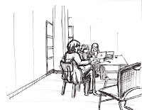
BOUDARIES play a role in design in more ways than one. For example, obvious literal boundaries exist in things such as the wall that surrounds the Acropolis and even the Agora, an area near the Acropolis as Roth says on page 222, “who’s boundaries were defined by the surrounding houses and public buildings.” Also natural boundaries were created But in another sense, I have learned how when drawing a scene, the lack of an obvious boundary can effectively be turned into a dynamic way to create a boundary in itself. This drawing of Suzanne and her TA’s shows how deciding where the lines in the walls end serve as a good boundary for the image without an obvious solid border.
SECTIONS are used in many ways in design. In the literal sense when applied to drafting, this section view shows a “sliced” section of Pat’s piece of furniture so the viewer can better understand what is happening. The great columns had to be made in sections as Roth says on pages 242 and 243, “Each component block or column drum, each piece of narrative sculpture was crafted to perfection.” In another sense, section is applied in the ancient Greek architecture through the use of the porch, the court and the hearth. These sections each fulfilled a purpose for the way their society functioned. The Greeks went on to repeat these sections throughout their structures which resonated throughout architecture from their time on.
VIGNETTES are used to illustrate small scenes in a way that is easy to understand and pleasing to the eye. In this example I chose to draw the same scene twice and also incorporate multiview into these vignettes. By simply changing the choice of angle, color and color placement, these two images can portray two totally different feels. The use of all of these tools together become a large and powerful part of the way architecture works and how effective all designs are.
Tuesday, February 10, 2009
DRINKING AND DRAWING
This is a drawing I did in Tate St Coffee. I have to admit that I was kind of overwhelmed by how much was going on in the space... a lot to draw! I did this drawing in the morning so everyone was in a hurry and moving quickly. I tried to show the movement of the people in with the water colors.
I did this drawing at Barnes and Noble's coffee shop. I used the blue water colors to try to open up the feel of the image. It kind of makes the scene look spacey.
This drawing is of the same setting, just from a different angle. I tried to use different colors to get a different mood from the same scene as the previous image. I really liked the old guy that was facing me in the chair, he had a lot of character.
Wednesday, February 4, 2009
SCALE FIGURES
Here are a handful of sale figure drawing sketches that I though were both tasteful and helpful ...
- Gabi Campanario did this group
This is a cool drawing of a woman with her daughter by Isabel Fiadeiro
This is a layout of examples found on www.design-skills.org This site has a lot of helpful info for design drawing in general.
This site has a large amount of resources and examples of quick scale figure drawings
OPUS entry 2 : 2/4/2009
This week we continue our pursuit of design knowledge. Expanding and exploring what we know about the fundamentals in key areas of our craft. We work on our abilities to do technical drawings, illustrate people and things in a simple yet strong way, and learn about the ancient history of architecture and its place in the world. The key words of the prompts for this week’s entry seem to reverberate the basic messages all of us designers must comprehend and control if we are to do our job well. The phrase, COMMODITY : FIRMNESS : DELIGHT as coined by Sir Henry Wotten, builds on Vitruvious’ original statement that "Architecture must provide utility, firmness and beauty.” (Understanding Architecture, p. 11) From my perspective, this is an undeniable truth. There is no debating that it is the job of all architecture to fulfill these three categories. Commodity is present in the sense that there is a need that must be filled, or a job to be done if you will. Firmness is important because it addresses the necessity of durability in design and construction. Delight refers to the job of the designer and the design itself to be both aesthetically pleasing as well as physically pleasing. This idea is put into words well by Roth when he says, “Architecture accommodates psychological as well as physiological needs of the human family, whose basic social institutions are at the very least a million years old.” (Understanding Architecture, p. 160) While I have been talking about architecture, these ideas apply throughout all forms of design. Take for example this boot-Worn by a classmate, this boot to me echoes many of the same principals of design as architecture. Especially those of commodity, firmness and delight. Commodity - All people need shoes to survive and live day to day without getting injured or sick. Firmness- This boot is made of leather and in a style that has been used for centuries. Tried and true to this day, leather boots are some of the most durable shoes a person can buy. Delight- With out a doubt the angular cuts and stitching of the leather as well as the purple color make this pair of boots very beautiful.
The use of leather in the boots brings up the use of MATERIAL in design. Whether you are designing clothing, furniture or a house, what materials you have available and plan to use always plays a big part in how good your design will turn out. As we are learning about in Patrick’s class, the materials available greatly shaped the course of the ancient Egyptian’s architecture.
This is the “Pyramid of Zoser” as shown on page 197 in Understanding Architecture. It is important for us to learn about this culture because as Roth says, “Egypt is where western architecture begins.” (Understanding Architecture, p. 188) What’s important to notice about this picture is that the pyramid is made of sandstone, the most available material to the Egyptians. It is what they had a lot of and by paying close attention to its qualities, they managed to design and build something that demonstrated firmness for thousands of years.
The Great Pyramids of Egypt were a strong example of another important element of design, ILLUMINATION. Though they do not look like it now, when the pyramids were constructed, they were covered in polished white stone and had golden tops. In a setting of vast flat deserts of sand, the pyramids intentionally stood out. The Egyptians placed the gold tops on their white man-made mountains to catch the always present sun and illuminate their accomplishments. The point of illumination is to be able to see better. I could not help but think of the improvement of sight when I looked at Tristan’s artifact goggle’s he made …
IDIOM is described by some as a characteristic mode of expression in music or art. I do not know what Tristan was trying to express through his art but I’m sure they demonstrate some form of the use of idiom. As Sir Herbert Read says on page 159 of Understanding Architecture, all art is “a mode of symbolic discourse.” Again, the Egyptian culture was a powerful example of the use of idiomatic design. In order to memorialize the traditions of their culture and religion, they wrote stories on scrolls and engravings into their architecture. These stories were written in their language of hieroglyphics. This is an example of such hieroglyphics, found at fontriver.com
Other aspects of idiom are found in the interiors of all buildings in the present day. For example all buildings have furniture. A good piece of furniture typically encompasses the "style" that is inevitably "shared by all" people who are in the space. And if a piece of furniture is liked, it will become multi-generational as it is passed on through family members. This drawing I did is of a girl in class sitting in a chair that struck me a something that encompasses these elements of idiom in design.
This week, I feel we have learned a lot about where architecture and art began with the human race. It is becoming more obvious to me that all aspects of life, art and design are completely interconnected. Also I am starting to realize that in art, architecture and design, sometimes less is more. The use of simplicity in the lines of the designs of the pyramids are powerful. Equally powerful are the simple lines, rather than tons of shading that can be used in the gesture sketch of a person to express the energy of their pose. Of course we have much more to learn, but these elements of design are now a huge part of the catalog of knowledge we will use as designers.
- Jeff
Tuesday, February 3, 2009
Subscribe to:
Posts (Atom)