Tuesday, September 29, 2009

Composition Page


This is my composition combining some key images from this semester. It was definitely a learning experience while trying to format and print this properly. I think I have room to improve but this isn't bad for a first attempt.

Wednesday, September 23, 2009


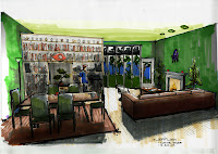
In this version, I combined lots of shading with the dodge and burn tools with shading from a filter-render-lighting effect tool. I also worked on filling in the grass and tree scenery in the window to make it look more life-like. Finally, I changed the walls to green and the ceiling to a yellowish tan which opened up the room a bit.

In this version I really focused on the shadows in the space I darkened all of the areas I thought were in shade with the burn tool and I lightened all of the highlights with the dodge tool. This really enhanced the depth of the drawing.

In this version, I decided to alter the color of my furniture. I changed the couch from brown to green, and the dining chairs from green to a red-purple. The small chair in the living room went from white to gray. Check out the original image below to see the differences between these three and where I began.

Monday, September 21, 2009

Get Loose


Here's my newest rendering... I'm actually very pleased with it. I spent a lot of time on this one trying to work in the style of Drpic and I think it turned out well.

Thursday, September 17, 2009

Ready set render


This is what I consider to be my best rendering of the three we have just completed, followed by Maud Gatewood's painting that inspired my color pallet. My first attempt definitely was a big warm up in remembering skills I have learned last semester. While I did draw a lot over the summer, I did not do too much in the way of rendering with markers. I am looking forward to trying to do better and come up with a more professional image in the next assignment. Practice makes perfect!

3D Models


So this is the model of my space we've been working on so far this semester. I think the model looks fairly decent and is a close representation of what I have drawn on paper. I am starting to figure out how to work faster in the sketchup software, I still feel a bit behind the curve. While making models in sketchup does take me a while, there is no question about how much time it save when I can print an image, and then trace the borderlinves to create renderings as we are doing now.

Thursday, September 10, 2009

SKETCHUP!


This image is of a small house I designed a couple of years ago when I was learning how to use sketchup. I had to post it to make myself feel better about how horrible I am at using sketchup now. I'm not sure if there's somthing weird going on with the way my new version installed, or maybe I'm just loosing my mind. Either way, I don't remeber having this much trouble with sketchup when I drew this house. Oh well, I'll figure it out...

NORTH PERSPECTIVE


Getting back in the groove again... I feel like I forgot so much over the summer. I'm still trying to remember how to do things, including perspective drawing as well as time management. This is the North prespective of my room I've designed that was due on tuesday. I feel pretty good about it, though I guess I should have spent the extra hour and detailed the books on the bookshelf.

Thursday, May 7, 2009

Wednesday, May 6, 2009

Opus entry 14 - COMING FULL CIRCLE

It is now the last week of my first semester back in school since taking a five year break from school to pursue my career as a musician. In the music world, there is a great sense of COMMUNITY. Looking back on this semester, I can see how the IARC program embodies the sense of community that I am gradually becoming part of as well. It is obvious to me now how all of the students and professors alike are very comfortable with asking each other for help or advice in an ever present dialogue. This is something I truly appreciate and I feel very happy and fortunate to have found a program that promotes such a comfortable relationship between the students and faculty. The feeling of community is essential for a healthy and happy life both outside and inside school.

As designers, we take on both the role and the responsibility of someone who is responsible or manages things. This may be what a room looks like or how a floor plan is laid out. Either way, designers in many ways must exemplify good STEWARDSHIP, considering that the decisions a designer makes will always have an impact on people’s lives and have a potentially long lasting effect either for the better or for the worse. “A perfect garden – no matter what size – should enclose nothing less than the entire universe.” – Barragan. I think this is a beautiful statement about the way all designers should in a not too serious way, understand how powerful of an impact they can make on other people’s lives. I am proud to call myself a designer, (or at least a designer in training…) and look forward to creating things and places that make other people’s lives better.

A great friend of mine and I used to always talk about how much we were going to do in life. How there is no way we weren’t going to get very far in life, and be ahead of the pack, all the while living life by our own rules. He had a phrase that he came up with that he would constantly say out loud to remind us all just what it was that we needed to do in order to put ourselves on top. The phrase was, “RELENTLESS INNOVATION.” His name is Jon Paul Pardy, and though I haven’t talked to him in a while, he is still a great friend and I have always looked up to him. These words mean a lot to me and some of my friends because constant changing and forward (and backward) thinking are essential to surviving in a world that grows only more competitive and complex each day. I hope and believe that through my time here in IARC, I will grow to be ever more innovative as long as I remain relentless in my pursuit of greatness.

The last word of the last week of the OPUS project: AUTHENTICITY. To be original, to be bold, to be yourself and nothing but. To be authentic is both a privilege and a gift. There is a large portion of society who has no idea what it means to be authentic and probably never thinks twice about it. I feel blessed to have both a comprehension and a desire to truly embody what this means. One of my all-time greatest heroes is a musician named Flea, from the Red Hot Chili Peppers. I would watch his bass instructional video every single day after school while I worked on being the world’s best bass player. While his video helped a lot with bass playing, in many ways he taught mostly philosophy on being an artist in the video. I definitely attribute a lot of the foundation of who I am and how I think as an artist in music and design to the ideologies set out in this video. Flea’s underlying message runs through my head on a regular basis, “No matter what you do, always stay true to yourself.” – Flea. It is my everlasting goal to live and die by these words.

Tuesday, April 28, 2009

Opus entry 13 - [PAIR]ING DOWN

A WEEK AND A HALF LEFT! Will I still be alive? I think so. When I think back about the projects and assignments we have completed so far this semester and then about how much more we have left to do, it makes my head hurt. My biggest consolation is that one way or another, it will all be over with in 10 days!


The Unity Temple by Frank Lloyd Wright brings the words MEDITATION and CELEBRATION to life in a physical form. The concept of the structure is inscribed in the wall over the doorway of the holy place, “For the worship of God and the service of man.” This building is the one I am exploring and representing for my precedent analysis. For me personally, lately I feel starved for time needed for meditation. However once this semester is over, I am positive I will have a great celebration on May 9th.


The use and control of the balance between LIGHT and SHADOW are imperative for good design. Obviously the overall usefulness and the mood of a room are controlled by light. The Unity Temple has a grid pattern ceiling with skylight windows in all of the gaps as well as windows lining the tops of the four walls in order to let light shine down on the people in the space from above. In the drawing above of the column detail, I used line weight in a simple way to make the parts of the column appear more 3D showing a difference between light and shadow.


For our final presentation boards for our precedent analysis project require a lot of thought and consideration. It is our task to TRANSPOSE the images and ideas in a way to tell the story of our building. We have to be careful to intentionally JUXTAPOSE all of the pieces of the board in a way that comes across in a cohesive and legible manner. This is my layout scale sketch for how my final board will be arranged.


In history we have been looking at the modern and post-modern architecture of the mid 20th century. It seems a lot of the structures of the period played with blurring the lines between the LITERAL and the ABSTRACT. The Air Force Chapel in Colorado was a nice example from class of a building that was intended to be an abstraction from the literal form of the Native American teepees that once inhabited the area. The building also looks to me as if you took the Air Force symbol and stretched out in an accordion like fashion to make it stand upright and reach towards the heavens.


One of the biggest things I feel I have continues to learn more about through my time in the IARC program is how much communication happens without ever using words. With the never ending technological advances, it seems our MONOLOGUES and DIALOGUES must constantly adapt to some new media. In drafting class, we are getting what for most people in the program’s first introduction to Google Sketchup. The above image is my rendering in sketchup of the corner offices of Gatewood. This is just one of many ways designers must learn to communicate and experiment ideas.

Wednesday, April 22, 2009

Opus entry 12 - Action Verbs

Now in the 12th week of the semester, I am positive that I am not alone when I say that I am wearing thin. Only a couple weeks left, but I can explain how excited I am for this semester to be over. I do not mean this in an all-bad way; rather I am just ready to move on from the classes I am in. Not to mention of course the immense amount of ACTION VERBS that I currently have to undertake while struggling to keep up with the work load of the 5 classes I am in. Lately I find myself in a kind of bi-polar mind frame bouncing from feeling either completely overwhelmed, exhausted and “over it” and then finding myself feeling totally excited and inspired for the pieces I am planning on completing over the summer.


If I had to SPECULATE, I would say that these feelings and challenges everyone in the program is feeling right now are intentional and implied. I would also speculate that this is in an effort to instill a work ethic in us as students and also perhaps to push us to see where everyone’s breaking point is. I am okay with this and though I can’t honestly say I enjoy it, I understand the point to some extent and anticipated this being the scenario for the end of the semester. How does this apply to what we are learning in history and drawing and drafting? I feel that the modern movement of the early to mid 20th century involved designers SPECULATING what they thought would be the template and pattern or style if you will for the future of architecture and design. An epicenter for this was the Bauhaus in Germany. I would speculate that they definitely left their mark and made an impact. Did it totally transform everything that came after it? I would say probably not.


We have all been working countless hours on our composite illustrations for drawing class. They turned out pretty good, but after staring at mine for so long, I feel like all I can see are its flaws. Our huge final project for both history classes is to COMPOSE “diptych” that represents our precedent analysis project. As designers we must take care and put thought into everything we do, on every scale. “In 1927 Mies was involved with the first international statement of Modern architecture when he directed the Deutscher Werkbund housing-scheme at Stuttgart, known as the Weissenhofsiedlung.” (Massey, p.79) This was a group of designers making a conscious decision to “compose” a style or architecture and design. While we work on “composing” thumbnail sketches for final presentations, we also must “compose” our class track and overall plan for the rest of our lives. To be completely honest, while I’m glad I have the foresight to think about the composition of everything I do, it is a part of my personality that is overwhelming at times. Sometimes I wish I didn’t have to think about anything at all. I truly cannot imagine what that would be like.


Like many people, I rely on coffee to ENERGIZE myself. Lately I’ve had to rely on that quite a bit. People use coffee to energize themselves because of the caffeine. I have always been perplexed by the phenomenon of the ability of an environment to affect the mood of people as well. The fact that you can walk into a space indoors or out, and be “energized” by your surroundings is crazy. For example, Noguchi’s coffee has something about it that gives me energy. A certain group of designers recognized this and made use of design to control the feel of a space. “The early Modern designers hoped to change society for the better with the creation of a healthier and more democratic type of design for all.” (Massey, p.63)


When talking about the Modern movement in design, SHAPE was an important element. I think particularly the square was important, considering the cubist types of plane and stripped down buildings that became iconic of this era. While curvy, freeform organic shaped furniture was developed at this time, the work of architects like Mies Van Der Rohe shows a strong influence of the basic square and rectangular right angle shapes.


The exaggerated STRETCHING of the rectangle in the horizontal direction is a defining characteristic of much of Frank Lloyd Wright’s work. This is demonstrated well in the Fallingwater house. As Massey says on page 84, “The vast living area has extensive windows to integrate indoors and outdoors, and a natural stone floor.” This element of “stretching” the space of the great room became popular in many houses of the mid 20th century.